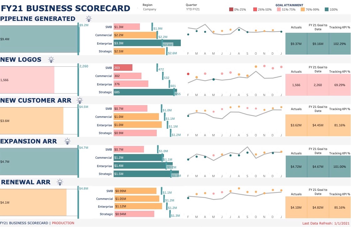
Business Scorecard
The Business Scorecard was created to help the leadership team understand how the business was performing against yearly goals across a variety of metrics. For this request, I wanted to ensure I created a design that instantly captured the holistic health of the business, rather than requiring the users to navigate to multiple places or use multiple clicks. Therefore, you’ll notice this dashboard has all the necessary information on the initial view.
Size and vertical lines are used to visually represent attainment for a specific goal. Color encoding is also used to represent how well the business is tracking against that goal.
Reading left to right, the all up total for a metric is displayed at the beginning of each row. Next to this is the metric split by segment, an important detail for this business to isolate potential issues. The line chart shows the actuals by month, the goal represented by the circle. Last, the user can see the number for the actuals, goal, and tracking %. If the user would like to see the far right charts for a particular segment, they can filter by making a selection on a segment name.
One of my favorite parts of this dashboard is how it helps alert the leadership team, in real time, to potential issues. This allows them to quickly action on problems before they have the time to fester.
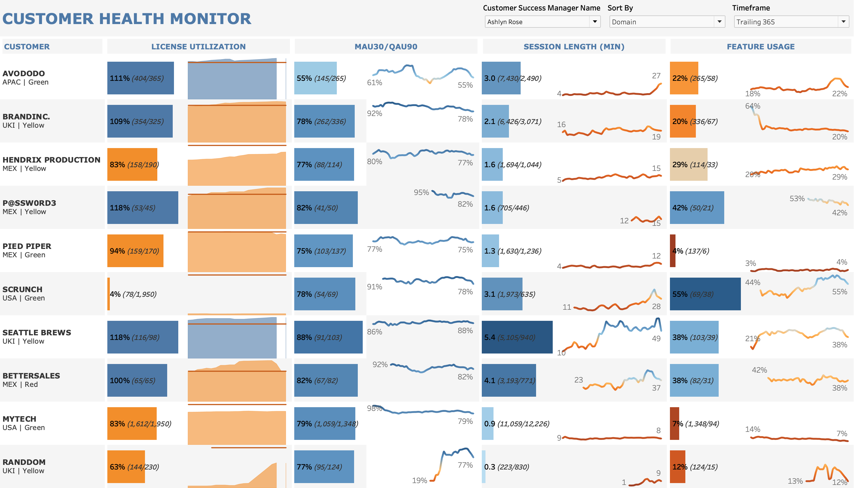
Customer Success Monitor
The Customer Success Monitor was created to analyze customer product usage data, enabling the CS lead with information to quickly identify potential issues and ensure successful interactions with their customers.
Size, height, and color are all used to visually represent customer performance for each metric.
The current value for each metric is represented by the bar, followed by a time series to show how that metric has changed over time.
One of the most impactful parts of this dashboard is the ability to sort. For example, a user could sort all their customers by any metric, let’s say license utilization, and easily identify their lowest and highest performing customers. The CS lead can now compare behaviors and strategies used with their highest performers and apply those to their lowest performers.
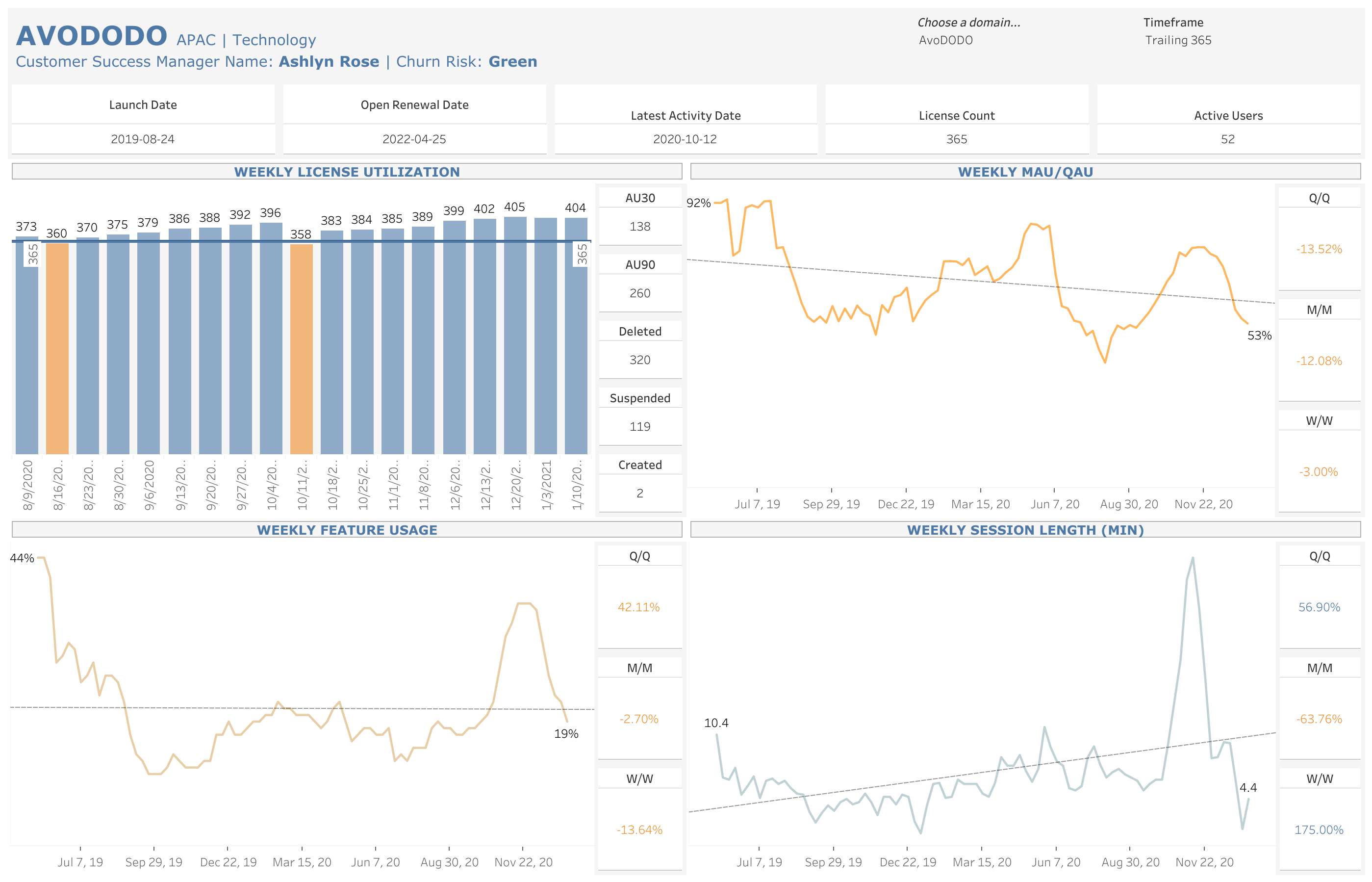
Single Customer Dashboard
The Single Customer Dashboard encapsulates a single customers usage and is a child of the Customer Success Monitor (above). The user can select a customer from the Customer Success Monitor and follow the hyperlink to this tab. This dashboard contains much more detailed information on a particular customer and is also something that could even be shared with them.
An important aspect for understanding a customers usage is being able to differentiate between natural seasonality and atypical customer behavior. A linear regression fits our data well, so we used this to highlight the overall trend for each metric. The more negative the slope of the linear regression, the line will be colored in increasingly brighter orange. Conversely, the more positive the slope the brighter the blue of the line.
By having such detailed and easily accessible analytics on their customers, CS leads are more empowered to drive adoption and prevent churn.